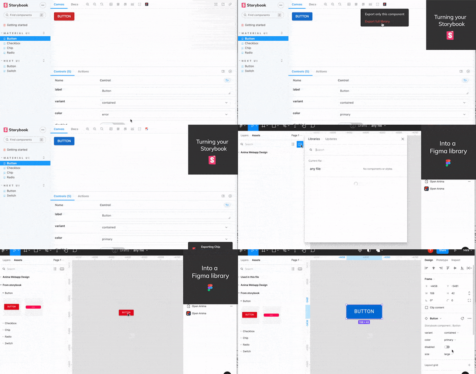
Generate a shareable Figma library from Storybook in a single click
We're automating integration between your design library and code.
Using component libraries is the best way to create and maintain consistency across your entire product. This is especially true if you’re working on a large, dynamic product or with a broad, distributed team
But how hard is it to keep your design library up-to-date with the components in your codebase? How about making sure component names in your design match those in the code? Or determining which components have already been developed, and which ones only exist in Figma?
Not as hard as you think if you let Anima automate the process for you.
Go from Storybook to Figma with Anima
Now you can build a native Figma library from your code component library—automatically—in a single click.
- Generate a Figma library file from your live code components including all variants and naming conventions (with Anima)
- Publish and share it with your team (natively within Figma)
✅ Your team can now build flows with the exact components that your users are seeing—using Figma’s native capabilities.
Who is this for?
Designers
Create a Figma library file based on your existing code components
👉 Know which components exist in production (see what your users are seeing)
👉 All code components are built as Figma components (reuse instead of reinventing what already exists)
👉 All properties defined in the code are mapped into variants
- Use Figma’s native UI capabilities without changing how you work
- No more designs that get lost in translation
Developers
- Encourage your designers to re-use existing components (instead of designing similar components from scratch)
Get designs that contain the exact components you have in the code
👉 Same names and properties
👉 Link to each component in Storybook
Know if the design you’re handed is re-using existing components, or contains new components you’ll need to build
What’s next?
1. Visual accuracy
We’re eliminating visual differences between your code components and your Figma components by adding extensive support of CSS properties
2. Responsiveness
We’re making your components as useful as possible by translating existing CSS props into Figma Auto Layout definitions.
3. Continuous sync
We’re ensuring that your Figma library is always up-to-date with what exists in the code. We’re adding a function that informs you when a component’s code has been changed, with the option to update it throughout your design in a click.
Ideas or requests? Let us know!
We’re constantly working to improve the Anima+Storybook integration, and we’d love to hear your thoughts. Let us know what you like, what you don’t, and what features would make this the perfect integration for you.
Feel free to reach out to us using our Discord community to ask questions, provide feedback, report bugs, and request features 🙂
The post Generate a shareable Figma library from Storybook in a single click, written by Yarden Katz, appeared first on Anima Blog.
